Möchten Sie die Grundlagen der mobilen Suchmaschinenoptimierung kennenlernen und wissen, wie Sie sie zu Ihrem Vorteil nutzen können? Dieser Artikel enthält alle Informationen, die Sie brauchen. Einfach ausgedrückt, ist mobile SEO eine für mobile Geräte angepasste Suchmaschinenoptimierung.
Lesen Sie die folgenden Abschnitte, um zu erfahren, warum diese Vorgehensweise immer wichtiger wird – und warum sie in Zukunft wahrscheinlich noch wichtiger sein wird.
Inhaltsverzeichnis
Was ist Mobile SEO?
Wir sprechen von Mobile SEO, wenn wir die Optimierung einer Website meinen, um ein exzellentes mobiles Surferlebnis zu bieten.
Mit anderen Worten, das Ziel ist, dass der Nutzer die Website korrekt sieht und ohne Probleme navigieren kann, wenn er von seinem Handy aus darauf zugreift. Die User Experience sollte unabhängig von der Größe des Gerätebildschirms optimal sein.
Warum ist Mobile SEO wichtig?
Es gibt zwei Hauptgründe, warum Mobile SEO nicht nur wichtig ist. Es ist eine entscheidende Überlegung im heutigen digitalen Marketing.
In erster Linie ist es wichtig, weil der mobile Traffic größer ist als der Desktop-Traffic. Mobile Geräte sind enorm verbreitet. Sie sind so tief in unseren Alltag integriert, dass viele Menschen gar nicht mehr merken, dass ihre mobilen Geräte ihre bevorzugten internetfähigen Geräte sind.
Zweitens: Mit großem Traffic kommt großes Potenzial. Google betont seit Jahren die zunehmende Bedeutung der Optimierung aller Websites für mobile Geräte. Für den Fall, dass sich noch jemand fragt: Im Jahr 2018 wurde klipp und klar gesagt, dass Mobile Usability ein wichtiger Rankingfaktor ist. Dazu gehören (aber nicht beschränkt auf) die Seitenladegeschwindigkeit und das Responsive Design. Das ist der Grund, warum Suchmaschinen begonnen haben, sich auf einen Mobile-First-Index zu verlassen. In diesem Sinne begannen sie, die Suchrankings darauf zu stützen, wie gut eine Website auf mobilen Geräten funktioniert.
Heute zweifelt also niemand mehr daran, dass Mobile SEO der Schlüssel zur SEO-Branche ist. Glücklicherweise unterscheidet sich Mobile SEO nicht drastisch von normalem SEO. Es erfordert lediglich einige spezifische Überlegungen, die du in den folgenden Abschnitten kennenlernen wirst.
Was ist der Mobile-First-Index von Google?
Heute überprüft der Googlebot in erster Linie die mobile Version jeder Website, auf die er trifft – daher das Konzept des „Mobile-First-Indexing“.
Wenn du möchtest, dass deine Website wettbewerbsfähig bleibt und in Zukunft hoch rankt, ist das Erstellen von exzellentem Content, der Besucher anzieht, nach wie vor unerlässlich. Es ist jedoch fast genauso wichtig, eine responsive Website zu hosten. Sie sollte schnell laden und alle Inhalte angemessen anzeigen, wenn sie von einem mobilen Gerät aus betrachtet wird. Dies ist wohl die wichtigste Implikation von Mobile-First für Webmaster.
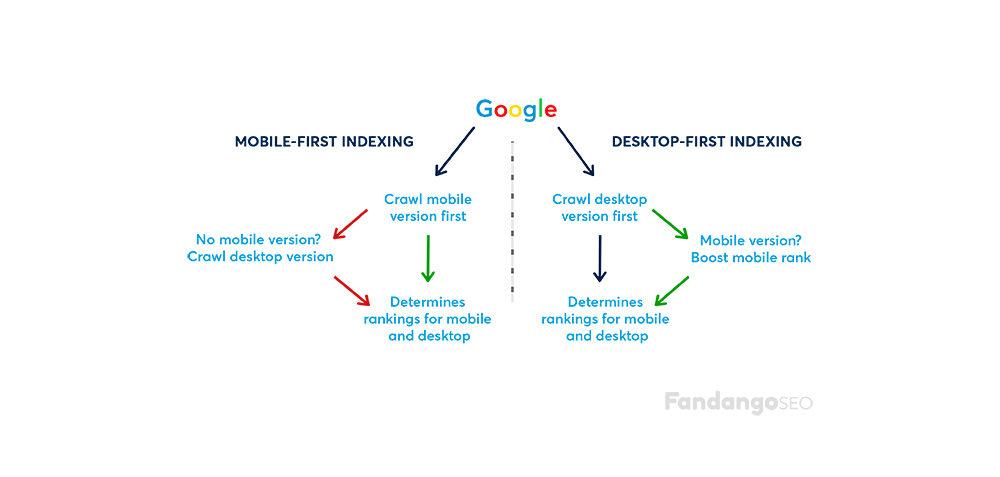
Die Umstellung auf Mobile-First-Indexing setzt Website-Entwickler ganz schön unter Druck. Sie müssen sicherstellen, dass Besucher, die von einem Mobilgerät aus surfen, eine positive Erfahrung machen. Die mobile Version einer Website ist nicht länger nur ein nachträglicher Einfall. Sie wird jetzt quasi als die Hauptversion angesehen. Egal, wie du die mobile Version deiner Website hostest, du musst sicherstellen, dass alle Inhalte korrekt und schnell angezeigt werden, wenn von einem Mobilgerät aus darauf zugegriffen wird.
Aus Webdesign-Sicht sind reduzierende Menüs (die einst als potenzieller Desktop-SEO-Fehler galten) in diesem neuen Paradigma deine Freunde. Sie sind eine nützliche Lösung, um Inhalte visuell zu strukturieren und den verfügbaren Platz auf kleineren Bildschirmen optimal zu nutzen.
Wenn du noch keine Zeit und Energie in die Gestaltung einer mobilen Version deiner Website investiert hast, ist jetzt der richtige Zeitpunkt. Eine deiner wichtigsten Prioritäten sollte es sein, sicherzustellen, dass sie reibungslos funktioniert.
Glücklicherweise kannst du Responsive Design verwenden, um eine einheitliche Version deiner Website zu hosten, die sowohl auf mobilen als auch auf Desktop-Geräten einwandfrei funktioniert. Im Abschnitt weiter unten erfährst du mehr über diese Option und einige ihrer Alternativen.
So implementieren Sie eine mobile Website, die in Google rankt
Wenn du die mobile Benutzerfreundlichkeit deiner Website verbessern möchtest, solltest du eine mobile Version der gesamten Website erstellen. Das liegt daran, dass Mobile SEO dem normalen SEO sehr ähnlich ist, aber spezifische Anpassungen erfordert.
Es gibt drei Möglichkeiten, eine Desktop- und eine mobile Version einer Website zu hosten: Hosten der mobilen Version auf einer Subdomain, dynamische Bereitstellung oder Verwendung von Responsive Design.
Das Hosten der mobilen Version auf einer Subdomain ist eine technisch veraltete Lösung. Dies beinhaltet das Betreiben von zwei separaten Versionen deiner Website, was überhaupt nicht praktikabel ist. Abgesehen davon, dass es unübersichtlich und mühsam ist, entspricht es nicht den aktuellen SEO Best Practices.
Dynamic Serving ist eine etwas bessere Option. Es ermöglicht dir, automatisch zwei verschiedene Versionen deiner Website von derselben URL aus zu hosten, abhängig vom User-Agent, der die Anfrage stellt. Obwohl es technisch nahtloser ist, ist es immer noch eine unübersichtliche Lösung, die die Verwaltung von zwei separaten Website-Versionen im Hintergrund beinhaltet.
Laut Google ist die beste verfügbare Option der drei Responsive Design. Der Grund dafür ist, dass es das Hosten einer separaten mobilen und Desktop-Version von derselben URL unter Verwendung derselben Codebasis ermöglicht. Hier liegt der Fokus einfach auf der Anpassung des Designs als Reaktion auf den User-Agent, der die Anfrage stellt. Dies ist die technisch eleganteste Option. Außerdem ermöglicht es die sofortige Aufnahme von Websites in den neuen Mobile-First-Index.
Indem du dich auf Responsive Design verlässt, anstatt zwei separate Versionen deiner Website zu hosten, sparst du dir in der Tat eine Menge Ärger. Wenn du verschiedene Versionen betreibst, musst du sicherstellen, dass viele Faktoren über beide Versionen hinweg sehr konsistent bleiben. Dazu gehören strukturierte Daten, Metadaten, soziale Metadaten, Sitemaps und die Kapazität der Website, um nur einige zu nennen.
Sobald du Responsive Design implementiert hast, stelle sicher, dass du dies den Google-Bots deutlich mitteilst, indem du meta name = “viewport” irgendwo im Head-Bereich deiner Seiten hinzufügst.
Mobile SEO Best Practices
Wenn die Seite bereits gut für Suchmaschinen optimiert ist, ist es notwendig, einige Anpassungen im Mobile SEO vorzunehmen:
Konzentrieren Sie sich auf die Benutzererfahrung
An diesem Punkt fragst du dich vielleicht, was du tun kannst, um das mobile Erlebnis deiner Besucher zu verbessern und sicherzustellen, dass deine Website jedes Mal einwandfrei funktioniert. Einfach ausgedrückt, du musst die Leistung über die Ästhetik stellen. Alle Punkte, die wir unten erwähnen, tragen zu einer besseren Benutzererfahrung bei, also notiere sie dir.

Verbessern Sie Ihre Seitengeschwindigkeit
Der offensichtlichste Aspekt einer exzellenten Website-Performance läuft auf eine einfache Variable hinaus: Seitenladegeschwindigkeit. Das ist auch keine zufällige Lieblingsbeschäftigung von Google-Ingenieuren! Es ist eine bekannte Tatsache, dass Websites, die mehr als ein paar Sekunden zum Laden benötigen, in der Regel Besucher verlieren.
Schnelle Ladezeiten zu erreichen, kann ganz schön knifflig sein, da Webseiten dazu neigen, immer größer, Seiten immer länger und Widgets immer zahlreicher zu werden. Aber ein guter Programmierer kann die Ladezeiten verkürzen. Die Seitenladegeschwindigkeit ist eine sehr objektive und direkt messbare Variable. Investiere so viele Ressourcen wie möglich in die Verbesserung dieser Variable, damit menschliche Besucher und Suchmaschinen-Bots deine Webseite zu schätzen wissen.
Wenn die Ladegeschwindigkeit beim Öffnen einer Webseite auf einem Desktop schon wichtig ist, ist sie auf dem Handy aufgrund von Konnektivitäts- und Hardware-Gründen noch wichtiger. Daher ist es notwendig, das Gewicht der Bilder und des Codes auf ein Minimum zu reduzieren. Vermeide außerdem Weiterleitungen und nutze den Browser-Cache.
Blockieren Sie keine CSS-, JavaScript- oder Bilddateien.
Früher konnten einige Handys CSS, JavaScript oder Bilder nicht unterstützen, da die Webseitenbetreiber einige oder sogar alle davon blockierten. Glücklicherweise wird dieser Fehler heutzutage nicht mehr so oft gemacht, aber es ist etwas, das wir überprüfen sollten.
Wir wissen, dass Googlebot Mobile die gleichen Inhalte wie die Nutzer sehen und sogar kategorisieren möchte. Daher ist es wichtig, CSS, JavaScript und Bilder in der Robots.txt nicht zu blockieren. Außerdem helfen diese Elemente der Suchmaschine zu erkennen, ob sie eine für Mobilgeräte optimierte Webseite erreicht hat oder eine andere Lösung.
Achten Sie auf das Design mobiler Websites.
Das mobile Gerät verändert die Art und Weise, wie Webseiten gestaltet werden, komplett, da der Trend zur Vereinfachung geht. Zu diesem Zweck ist es entscheidend, Folgendes zu vermeiden:
- Flash. Denk daran, dass Adobe Flash im Jahr 2020 eingestellt wurde. Außerdem haben die Handys der Nutzer möglicherweise dieses Add-on nicht, so dass sie den lustigsten Teil verpassen könnten. Verwende stattdessen HTML 5, um Spezialeffekte zu erzeugen.
- Pop-ups. Es kann für den Nutzer sehr ärgerlich sein, Pop-ups auf seinem Handy schließen zu müssen. Es ist besser, sie zu vermeiden, um eine hohe Absprungrate zu verhindern.
Es ist auch wichtig, auf die Schaltflächen zu achten. Wenn sie zu groß oder zu klein sind, kann es passieren, dass man sie unbeabsichtigt anklickt. Das kann auch passieren, wenn sie sich im Weg eines Fingers befinden, der versucht, die Seite zu scrollen.
Erstellen Sie ein responsives Webdesign
Responsive Design-Webseiten verwenden CSS3 Media Queries, um mobilen und Desktop-Nutzern die gleichen Inhalte anzuzeigen. Sie basieren auf einem flüssigen Raster und einem flexiblen Design, das eine automatische Anpassung an die Bildschirmgröße des Geräts ermöglicht.
Optimieren Sie Titel und Meta-Beschreibungen
Bei der Optimierung einer mobilen Webseite musst du bedenken, dass der Nutzer weniger Platz auf dem Bildschirm hat. Deshalb musst du bei der Erstellung von Titeln, Meta-Beschreibungen und URLs so prägnant wie möglich sein. Auf diese Weise sieht deine Webseite auf der Suchmaschinenergebnisseite besser aus.
Verwenden Sie Schema.org für strukturierte Daten.
Der begrenzte Platz auf dem mobilen Bildschirm führt dazu, dass ein Suchergebnis mit angereicherten Fragmenten noch eher auffällt als auf einem Desktop. Daher empfehlen wir, strukturierte Daten zu implementieren, wann immer du kannst.
Optimieren Sie die Website für die lokale Suche
Falls dein Unternehmen einen direkten physischen Service für Kunden anbietet, solltest du daran denken, deine Webseiteninhalte für die lokale Suche zu optimieren. Dies erfordert, dass du deinen Namen, deine Adresse und deine Telefonnummer in die Metadaten der Webseite aufnimmst. Vergiss auch nicht, den Namen der Stadt und des Landes anzugeben.
Dynamic Serving wird nicht mehr empfohlen
Wenn du dich erinnerst, ermöglicht Dynamic Serving die Anzeige verschiedener HTML- und CSS-Elemente, je nachdem, mit welchem Gerät der Nutzer zugreift. Diese Vorgehensweise wird nicht mehr empfohlen, insbesondere wenn wir die Anwendung des Mobile-First-Index berücksichtigen. Da Google die mobile Version hauptsächlich für die Indexierung und das Ranking verwendet, ist es nicht verwunderlich, dass es von uns erwartet, dass wir auf beiden Geräten (mobil und Desktop) die gleiche Qualität der Inhalte anbieten. Aus dem gleichen Grund solltest du auch keine separate mobile URL haben.
Tools zur Validierung deiner Mobile SEO Website
Es gibt zwei nützliche Tools von Google, mit denen du analysieren kannst, wie deine Webseite auf dem Handy funktioniert: PageSpeed Insights und Lighthouse. Diese Tools sind sehr einfach zu bedienen. Wir empfehlen dir, noch heute deine Ausgangsleistung zu überprüfen und sofort nach Möglichkeiten zur Verbesserung zu suchen. Die von diesen Tools bereitgestellten Berichte zeigen dir die wichtigsten Punkte auf, an denen du vorrangig arbeiten musst.
Um detailliertere Daten zu erhalten, solltest du auch die neuen, speziellen Tools zur Messung der mobilen Leistung ausprobieren, die in den Google Webmaster Tools verfügbar sind. Es gibt ein schnelles Analysetool namens “Mobile-Friendly Test” und ein Tool für die Tiefenanalyse im Bereich “Mobile Usability”. Mach dich mit diesen Tools vertraut. Du wirst eine klare Vorstellung davon bekommen, was du als Nächstes tun solltest, um deine Webseite an die neuesten Nutzerpräferenzen und die Best Practices für die mobile Suchmaschinenoptimierung anzupassen.
Eine weitere gute Möglichkeit, die mobile Freundlichkeit deiner Webseite sicherzustellen, ist die Durchführung eines SEO-Audits, bei dem du deine Webseite von einem mobilen Gerät aus crawlst. Das kannst du ganz einfach mit einem SEO Crawler wie FandangoSEO machen. Du musst deine Crawls einfach als mobil einstellen.
Die Durchführung regelmäßiger Audits hilft dir, Crawling- oder Indexierungsprobleme zu erkennen. Darüber hinaus ermöglicht dir FandangoSEO auch, deine Core Web Vitals Performance zu überprüfen für Desktop und Mobile. Du wirst leicht Möglichkeiten erkennen, deine Webseite schneller zu machen.
Webseiten-Autorität Mobile UX